Designing A Space For Technology Enthusiasts
Introduction
From 2017 to 2020, I embarked on an exciting project to transform my traditional PC repair shop into a dynamic social space where programmers could meet, collaborate, and work on projects. Midway through this transformation, I shared an update on the progress. Now, as we close the chapter on this journey, I’m reflecting on the design process and what we achieved. For the final look before closing, be sure to check out the photos at the end.
The Vision: From Function to Form
We’re halfway through the refurbishment, and I’m thrilled with the results so far. The transformation has not only improved the shop’s aesthetic but also better reflects the space’s true purpose: a hub for computer enthusiasts. But how does one design a space like this, especially on a tight budget? The key was to refurbish organically, letting the design evolve naturally with each phase.
Stage 1: Essential Furnishings and Requirements
The first step was to outline the functional needs of the space. As any architect will tell you, “form follows function,” and this principle guided our decisions.
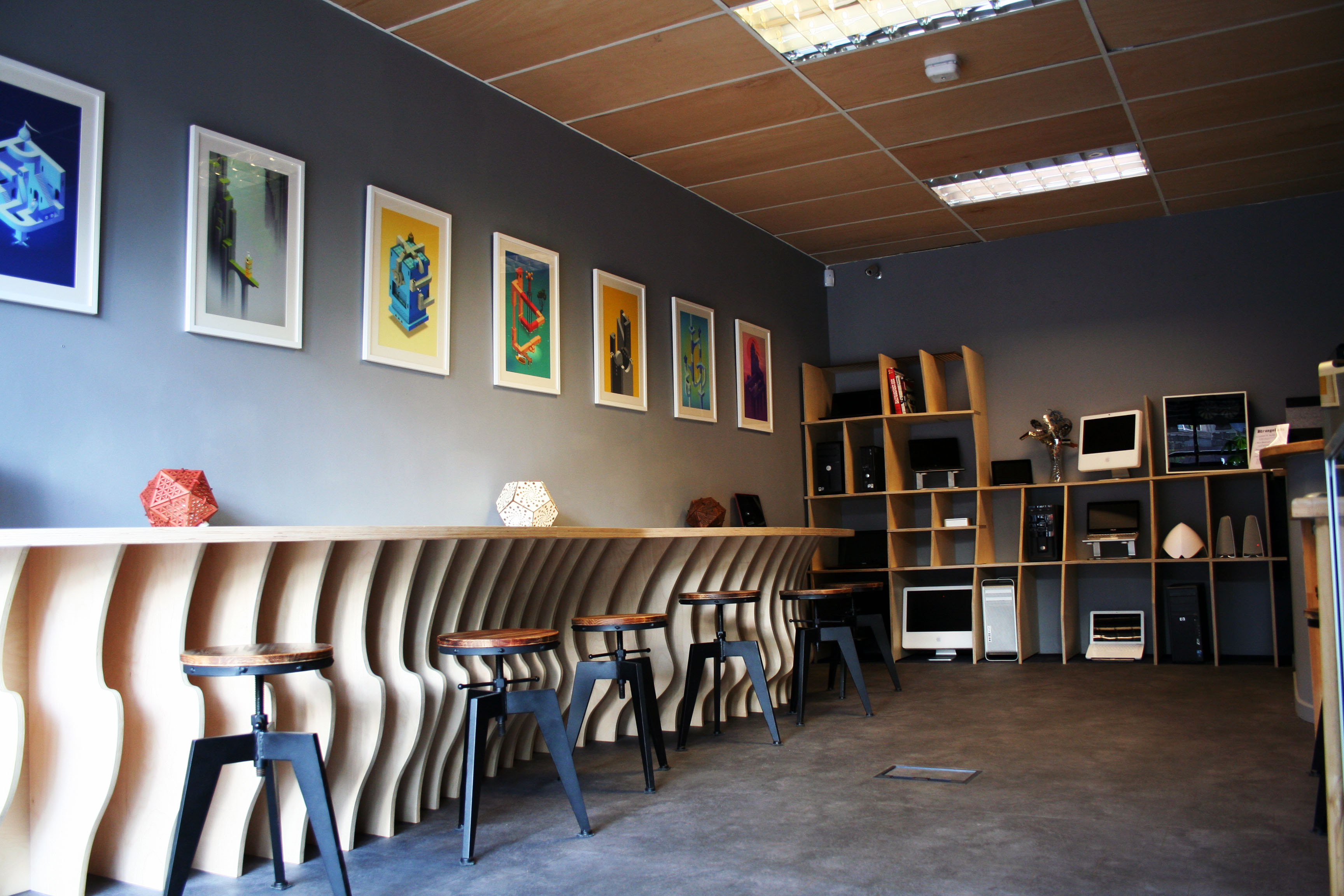
Looking back at the original shop, I realised what I disliked most: the colour scheme and style felt like a throwback to an early 2000s beige Windows PC; dull and uninspired.You know the type. The mixed-material flooring made the room feel cramped, and the temporary computer displays were far from efficient. To create a space where tech enthusiasts could thrive, while retaining the PC retail and services aspect, we needed: Efficient shelving for PC systems.
- A visually appealing way to display components and tech artefacts.
- A large workbench that could accommodate at least six people, complete with power outlets.
- A calming colour scheme to counteract the stress often associated with tech problems.
- A design that subtly echoed technological themes.
Stage 2: Crafting the Atmosphere
I had some clear ideas about the atmosphere I wanted to create. The goal was to make the space feel calm and timeless, something that wouldn’t become outdated quickly.
The original white walls were too harsh, especially when paired with outdated images of PC systems. The stark contrast between the walls and our purple-and-black branding was jarring. I noticed that many modern urban shops were opting for a dark grey (what I jokingly call “gentrified grey”), and I decided to use a lighter slate grey with a slight purple hue for the walls. This choice complemented the existing branding while softening the overall feel of the space.
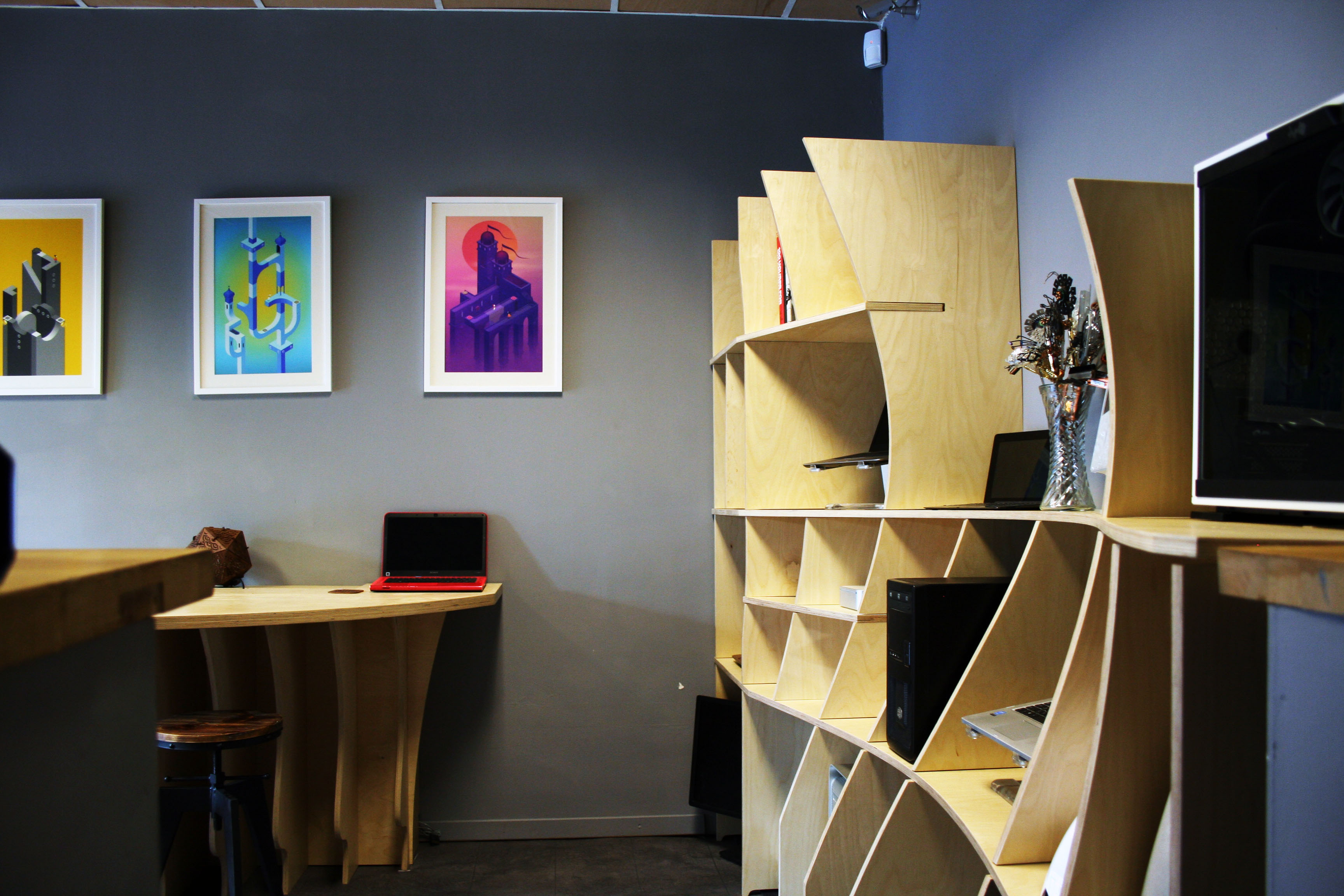
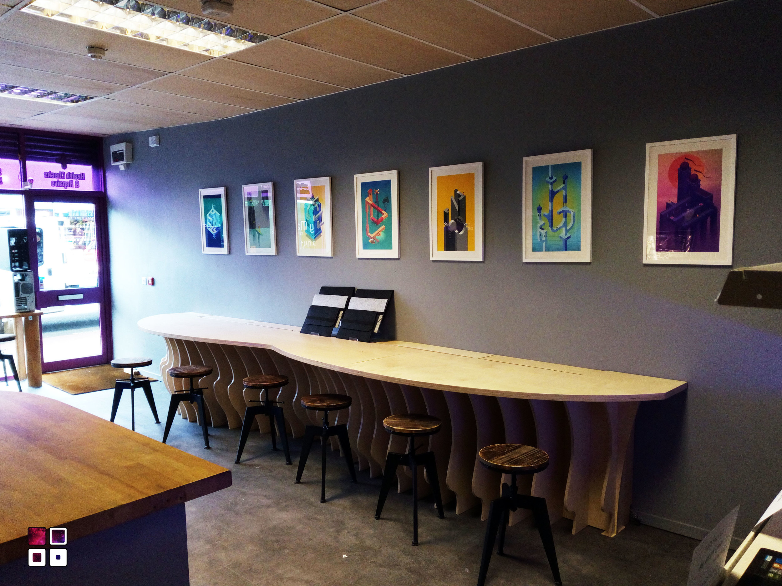
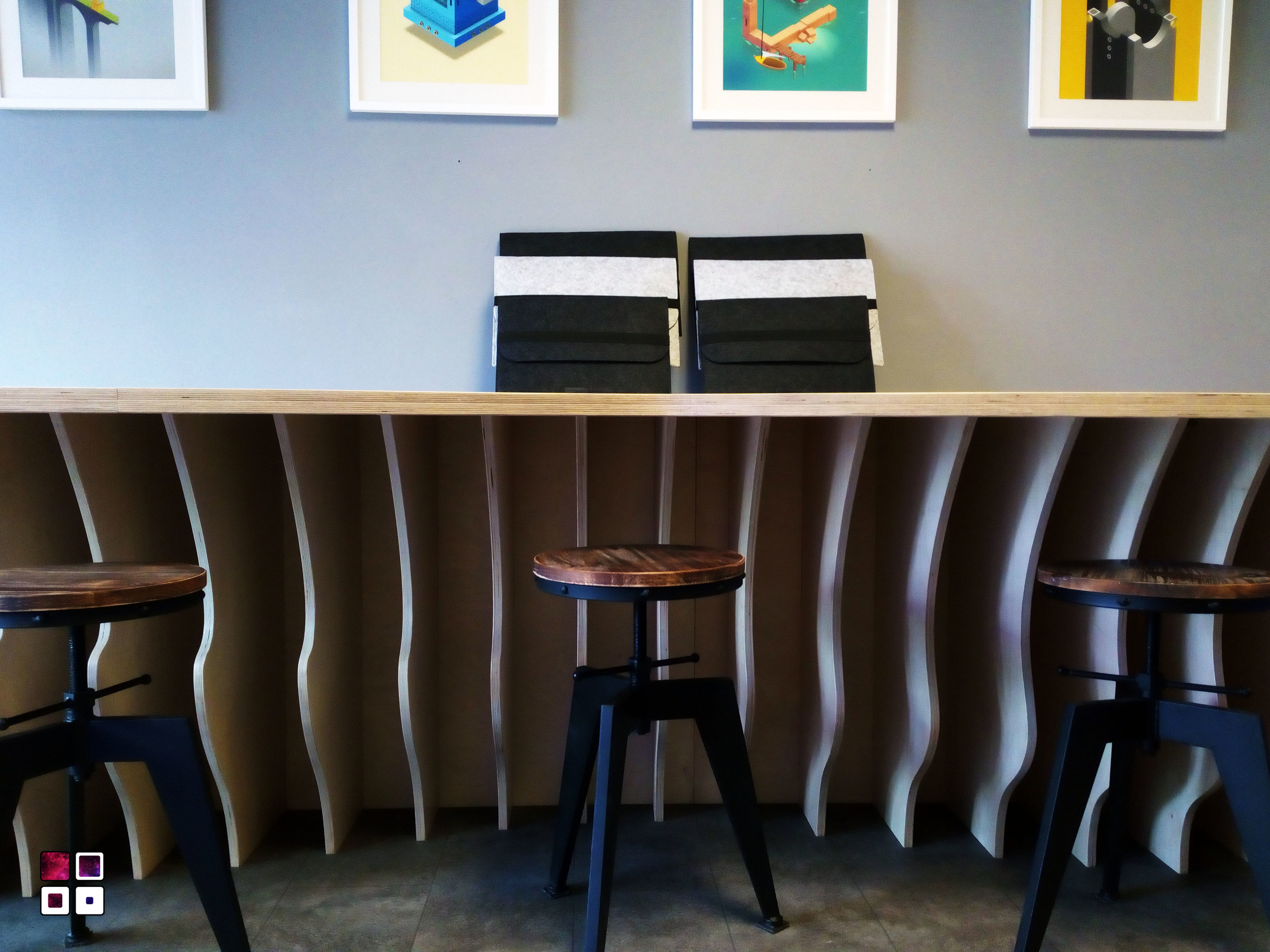
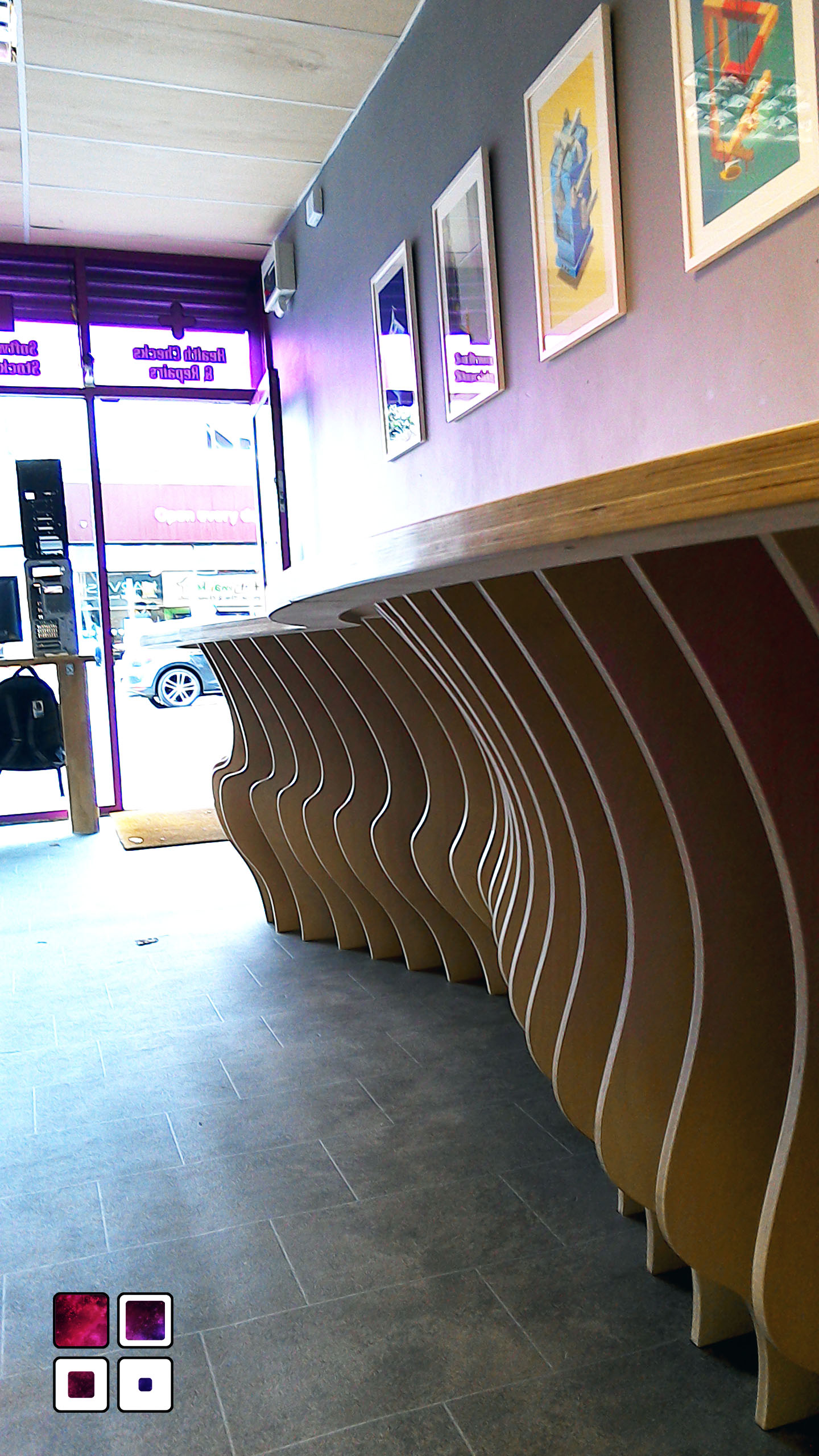
The old PC pictures had to go. Instead, I chose to adorn the walls with art prints from the game Monument Valley, known for its Escher-like puzzles and stunning level designs. These artworks added a touch of elegance and aligned with the shop’s technological theme.
For the furniture, I opted for wood, which harmonised with the purple branding and grey walls. Keeping the floor and ceiling consistent with this theme made sense, but there were practical challenges. The ceiling was suspended, and due to sound and fire regulations, I had to retain the existing tiles. We covered them with plywood sheets, which transformed the ceiling’s look while maintaining its functional properties.
For the flooring, I chose grey vinyl: affordable, easy to lay, and practical. I opted for a slate effect over a solid colour to help hide dirt and add texture. This choice also mimicked the look of a real slate floor, which would have been ideal if not for budget constraints.
Stage 3: Designing the Furniture
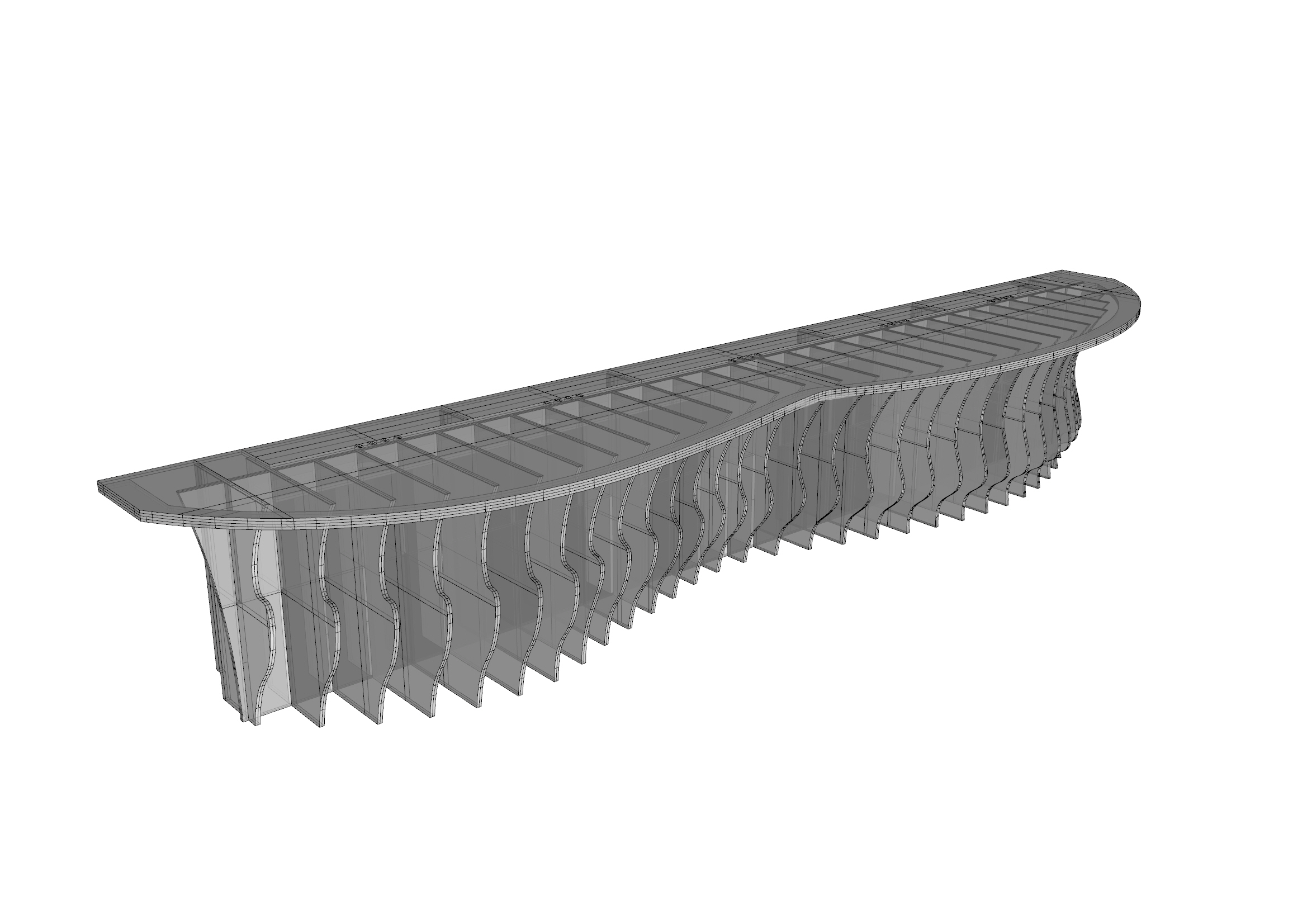
It was a no brainer for me that the furniture should be designed through the use of Parametric design: a method where computer algorithms generate forms based on defined parameters. We needed to create four key pieces:
- The desk
- The back shelves
- The side shelves
- The shop front sign
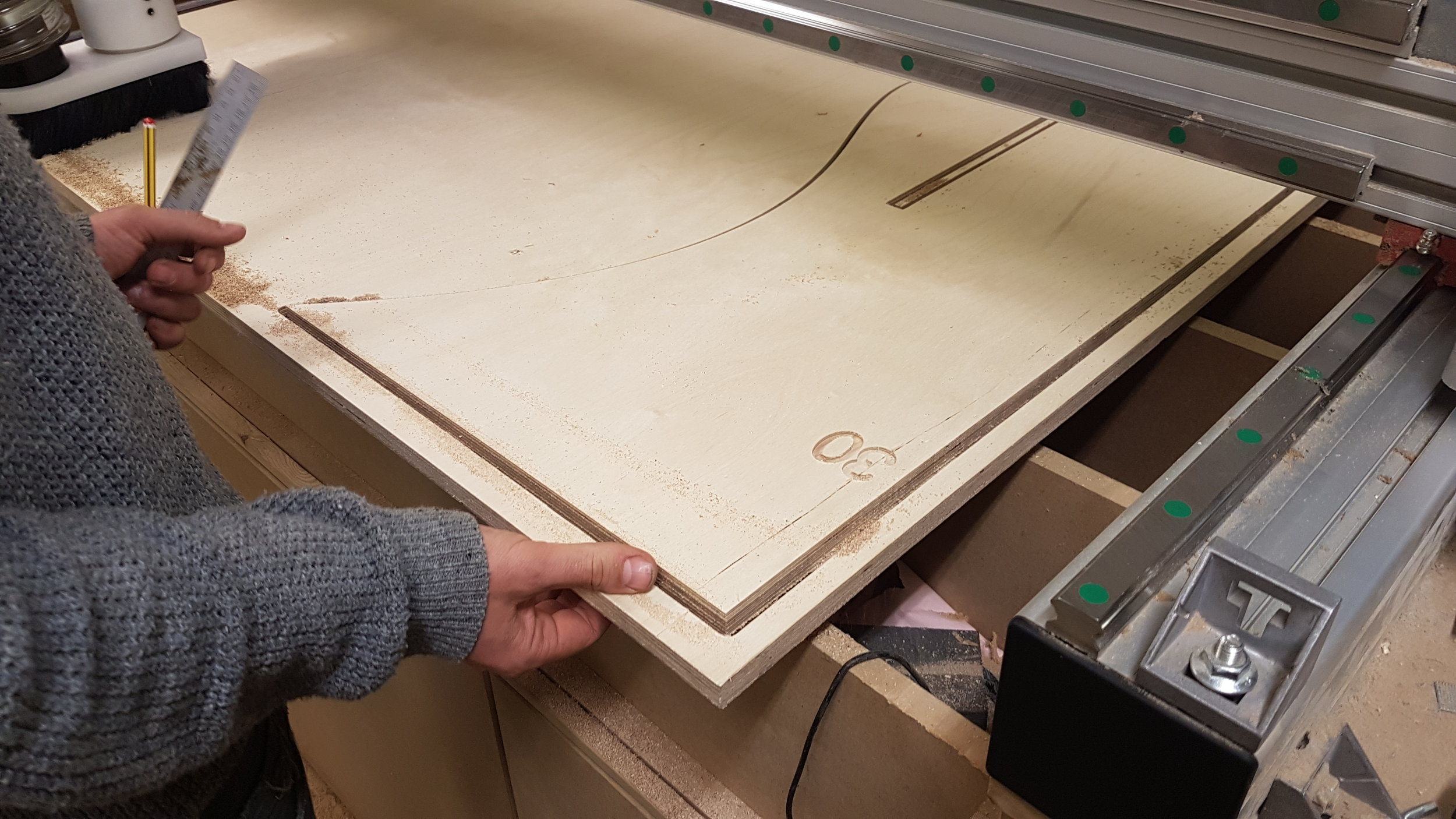
Parametric design allowed me to explore various forms and algorithms, showcasing the power of computational design. The desk was our first priority. Using a waffle grid design, where intersecting straight lines create curves and organic shapes, we were able to craft a unique, natural-looking structure. This design was not only aesthetically pleasing but also practical, as the components could be cut from standard wooden sheets using a CNC machine.
After several iterations, the final desk design featured a curved front, created by pulling attractor points on the computer. The pieces were then nested onto sheets to minimise waste, cut, treated, and transported to the shop, where assembly took just an hour.
With the desk in place, the shop’s transformation was well underway. Floors, ceilings, and walls were treated, and the desk installed. The remaining furniture would follow in due course, and I planned to share another update once everything was complete.
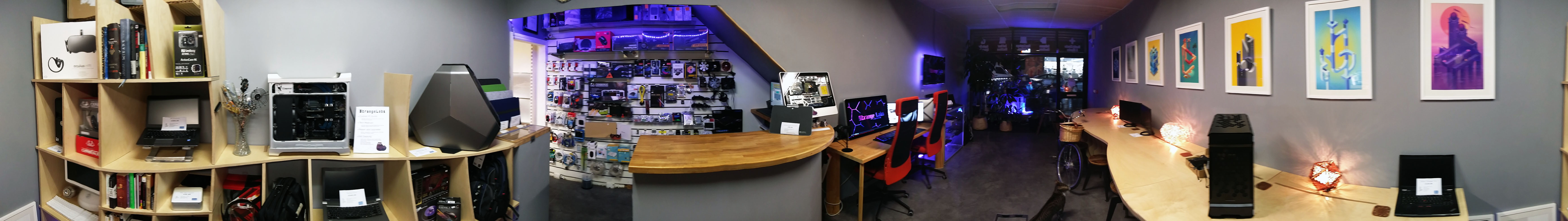
This is the shop as it stands now, floors, ceiling and wall treated, and desk installed. The rest of the furniture comes next and another blog post will follow. For now, here are some images of where we are at!
Update April 2020
As of April 2020, we’ve permanently closed our retail shop thanks to Covid, and I have taken the time to focus on new learning opportunities. While I didn’t achieve everything I set out to do, the shop was a success in its own right. Below, you can see the final form the space took before we closed our doors.